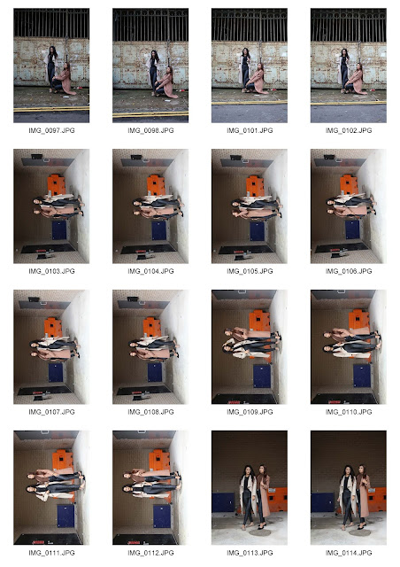
Following up from my research task and planning, I have chosen an LP record from the 1960's, 1970's and 1980's that I am going to interpret photographically. Here are my contact sheets from my shoots:
First Shoot - 1960:
Additional:
Second Shoot - 1970:
Third Shoot - 1980:
Overall, I am extremely happy with my shoots because I've got 3 different ideas and I've managed to conduct photoshoots for each plan. I've gone out on location for each shoot and used different picture taking techniques that I thought would be well considered for my album covers. For my 60's idea, I've managed to get some bokeh shots of the city lights which link to my song and album that I've chosen so I was pleased with them. The 70's shoot was about getting a similar idea of the city but in a still shot technique and I've considered my images to ensure it still links to the song title in my own interpretation. The 80's shoot was linking to the faces task of the location portrait photography and I wanted to get some urban/street portrait shots which is a collaboration of urban and portrait together and link them to my hip hop genre of music. I am glad that I've chosen 3 different genres because it gave me the chance to take different kinds of shots and hopefully it pays off.
Here are my final images that I've chosen and has been professionally printed. I've decided to print without any typography so it's purely based upon location however the typography section is also down below. These were printed on glossy paper and matte. Personally, I like the matte because it looks slick and it adds a more vintage effect with texture whereas glossy makes it more brighter in colours and a lot more sharper. I prefer either or on each picture because they all fit for purpose differently.
 |
| 1960 |
This is my 1960 album cover for the song 'Bright Lights, Big City' and this is my interpretation that I thought of from the title and lyrics. I thought of many ways of night photography techniques and I could only sum it up to light trails (which I done as additional in my landscape task) and just still shots. But then I thought of using bokeh as a technique to make it purely based on the lights and the location being the city. I also linked this with the lyrics of the song where it goes "bright lights, big city, gone to my baby's head" with the bokeh idea. This is almost like a blurred vision or like a hallucination so I thought it worked well when he mentioned in the head. I also envision bright lights, big city to be very classy so I thought this concept linked to the image because it is very classy to an extent because of the warm colours of the lights. Overall, I do feel like this is a well considered album cover and I managed to make it out of my own interpretation so the planning for this went well. I do like this in the glossy version more than matte because it fits more for purpose as it's related to the lights and glam so it's a lot brighter and sharper. However I also like matte because it flattens the image out so it's a lot slicker and I like the texture feel it adds.
 |
| 1970 |
This is my 1970 album cover for the song 'One of These Nights' and this is my interpretation of the song that I thought of from the title and lyrics. I've chosen to shoot at night to link this to the song title and because of the effects I get. For example, I love how the clouds are looking in this image. I went for this HDR effect because I love the gritty effects it gives the image, this was considered so that it works with the rock genre. I like how the location is fairly dark and you have the lights as a feature. This image inspired me from the lyrics where it goes "what turns on your lights", this is when I thought of the water fountain because they come on and off and I knew there would be lights at night. Also there's a bit in the lyrics where it says "and the wicked wind whispers" and that has been interpreted in the way where the wind is blowing the water towards one side. "The full moon is calling" links to the sky because you can see some clouds that are lit up so it's almost like a metaphor that the moon is calling. I like the lyrics "I can feel her and she's nowhere in sight", I've interpreted this where this is quite a busy scene with all the lights and yet it's still empty. So it's a bit like the city is 'her' to an extent. Overall there are lots of examples where I've interpreted the lyrics into my image and considered the image to fit the genre.
 |
| 1980 |
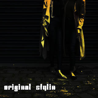
This is my 1980 album cover for the song Original Stylin' and this is my interpretation that I thought of from the title and lyrics. For the shoot, I've gone on location to fit hip hop music and went portrait shooting with my cousins. The shoot went exceedingly well and the landscape task helped me with visiting derelict sites. This image was taken near a black shop fence and I thought this was a nice location for the genre. I was inspired by my research work of the streets by Robert Blomfield and thought of creating my own style. I've decided to crop the image so the faces are not revealed and it's mainly focused on the outfit and their body position. This is where I've considered my music so it's just focused on the song title. I've interpreted Original Stylin' on the fashion whilst shooting at a street/urban location. The lyrics in the song where it goes "Now since I'm runnin the show", emphasised on the fashion idea more because it reminded me of a catwalk or something along them lines. So I thought this was a great idea to shoot the way I did. Furthermore, I decided the edit this image a little further and give it this yellow artwork. I felt like the yellow and black really worked well together and it became an interpretation of mine of the streets. I like how it turned it a little animated which makes it a little funky and quite distinctive. This just emphasises more on the title of Original Stylin' because it's the main focus point. Overall I think this album cover was well considered and I've managed to interpreted this in my own original way, no pun intended. This image on the glossy ProAm printout came out slightly darker than I expected however I personally like and prefer the matte version because it's a lot suited for purpose with that urban and street look.
Typography
For the typography work, I done these at home using this website https://pixlr.com/editor/ because of no access to Photoshop. So I felt like these weren't amazingly done like how I'm used to but it was worth the try.
For this typography, I've used this font which is quite a 'classy' look. I thought it worked with the title as it's about lights and city. I've selected white because it simply contrasts over the darker colours. I've placed the text in that position because I liked how it looked just above the blurry bokeh lights, and the focused bokeh in the foreground. I've experimented with the position and I felt like this was the best in comparison to the black background.
This is my typography for this rock album. I decided to go for this font because I think it fits the genre of music. In this example, I've also included the band logo which was done using this online editor, so it's not really perfect. But the idea is there. I placed the typography in the sky because I was linking it to the original album cover and I wanted the image not to be distracted by the text too much. I think it's a great position because it's not overpowering but it's still bold. The text itself is edited so it's black with a white outer glow. I didn't want the outer glow to look glowy so I just made it minimal so it's an outline.


This is my typography for my hip hop album. I've decide to have this in a white colour to contrast from the black and the yellow. I've positioned it on the bottom of the album cover because I was keeping it the same as the original but on the opposite side. This way the title is correlating with the models in the back. I also like how it's positioned on the brick tiles so it works with the street theme.
Additional Edits:
These are additional edits I've created before deciding on which one I thought worked best in my opinion. I like the black and white look but I thought it's more effective of the black and yellow with the street fashion theme.
Additional Albums
These are my additional albums that I've made after my first 3. I've decided to make an extra cover for each of the decade. I also printed these at ProAm in a matte finish to have a variety of album cover styles and you can see how both of these differ with one another. I personally prefer the matte but I think the glossy can be better to give the album cover some shine which could be interpreted as fresh. I've also added and printed these with typography unlike before to also give me a range of techniques and styles. Overall I'm happy with these additional albums and I'm glad I got around to making extras whilst being for each decade. It also gave me a chance to explore more into the genre and style so I can make my album cover fit well. This time the typography was edited using
Additional 1980's album

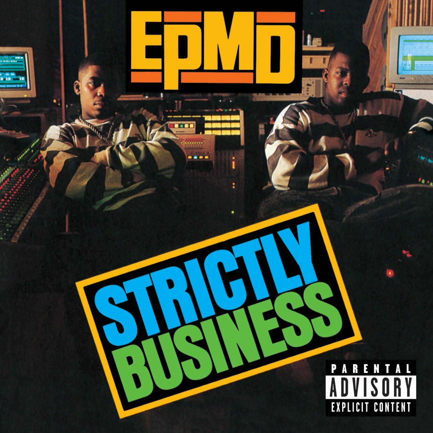
This is my interpretation of the album 'Strictly Business'. I have this album as a considered album referring back to my record picking task. I also had this image from my landscape task on location. As I was really fond of the image, I thought I would interpret this album and the image together for my own original idea. The album and the song is both called Strictly Business and I thought of interpreting this into this urban/street location. I think it's quite a strong image because it's taken at a derelict site and the impression I was creating of 'strictly business' in a hip hop perspective is all about the ghetto life. I was thinking of murder and drugs so my interpretation of "strictly business" is for people to mind their own business and let the group do what they do. Even the lyrics in the song has this hook of "I shot the sheriff" and this related to the ghetto life.
The typography I've used is distorted and I think it fits in with my ideas. I selected the font in black because it's bold and it works with the title as a statement. I've also added a white glow to make the font stand out from the image. I've positioned the text in the bottom corner because I thought the image was quite strong itself as I mentioned in the landscape task of editing the image making it bold. Overall, I am happy with the end result and I think it's quite an effective cover and image that links well with urban/street photography and hip hop music.
Additional 1970's album
This is my additional album for the 70's. I've chosen this image from 'the faces' task and thought of using this as an album cover because I liked how the image turned out. So I've selected this Debby Boone single called 'You Light Up My Life' because I thought it linked to the image. This is interpreted by having this silhouette of a face in the foreground with a light source in the background so it's like a play on phase and the light is like a metaphor for the person who lights up her life. I think the album cover is effective because of how the face is dark and the light is bang in the centre so it works great with the title.
I've used this font because it's a pop song and it fits well with the music genre. I think it looks quite funky and eye-catching. I've selected white because it's powering over the black and purple. I've also included the artist along with the album name. I've positioned this just a little above the centre so it's quite appealing to look at. I was considering where to position the text and I didn't want it to high up or too low near the nose so I thought this was the best. Overall, I am pleased with the matte finish print I have because it gives it this vintage effect with the texture and I just like how the matte works nicely with the silhouette making it mysterious.
Additional 1960's album
This is my final additional album cover for the 60's. I've chosen a song from The Beatles called 'Drive My Car' which is from the album 'Rubber Soul'. I've selected this image from the landscape task purely because of the car and the location. I've edited the image so it looks vintage with some additional noise. Then I put this together with the song title so it fits together. I printed this in a matte finish because I like how the additional effects it gives to the album cover, making it look quite old and rustic like a vinyl cover.
The typography is picked as it fits this rock genre. I decided to put this as white so it matches the car and the same with The Beatles logo. I also added a drop shadow on the title so it stood out from the tires. I decided to position the logo in the corner because it instantly attracts us and it informs everyone who's music it is straight away. I also positioned the title nearer to the bottom because it's quite away from the car. I'm pleased with this cover because of the image. I'm glad I found this vintage car and it suits really well with the 60's theme and The Beatles song.


No comments:
Post a Comment