In this task, I am researching photographers who produced location photography work during the 1960s, 1970s and 1980s. I've also created some moodboards that are revolved around the decades which will help me with producing my work. I will also look at some famous music photographer that worked around the three decades and see some of their portrait work.
Internet Research
1960's
1. Robert Blomfield


Internet Research
1960's
1. Robert Blomfield

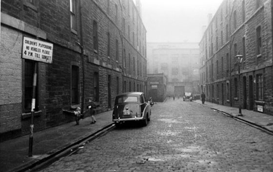
This image was taken by Robert Blomfield around the 60's and I think its quite a nice black and white vintage image of a old fashioned street. I like how there's an old car parked in the shot and it just emphasises on the style from the 60's. The lighting in the image is well considered with natural lighting and there's this nice effect of dark to light; this helps as a lead in to the image. The contrast plays a huge part because the dark, bold tone works well with the street photography genre and gives it this rough looking effect.

This is another example of Robert Bloomfield's image. This image overall reads mysterious to me. I like how the background is foggy and then you have this silhouette of a man standing by this metal fence. The contrast between the man and the fog also makes it eye appealing because of the difference in tones. I like the angle its shot at because the fences go straight across and that's parallel with the pavement. Furthermore, I like how the pavement is wet and this gives it more of an effect because of the reflection of the man. This was perhaps taken on a film camera as you can see the grains in the fog which gives it a nice misty effect.
2. Shirley Baker
2. Shirley Baker

This is one of Shirley Baker's photograph. This is another photographer who also captured this in the 60's. It is very similar to the previous photographer and you can see that black and white is quite frequent in location photography back in the days. I like how this image is composed with this small pathway, the boy and the reflection is in the centre of that pathway so it becomes the main focus. The picture is pretty self explanatory and I like the street feel you get from it because of how dark the image is.

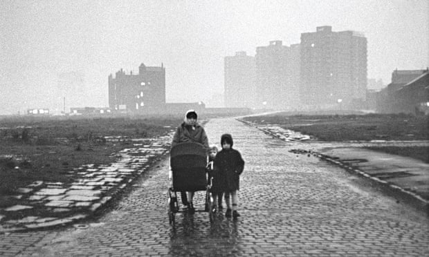
This is another photograph of Shirley Baker. I like the grainy look it has from the camera used. The tones on the images is quite nice and it's not too hard on contrast like the previous image. The location in this image looks like an estate and it works well for vintage street photography. I like the wide angle look on the image and there's this scale of the building to the people. This image shows a mother with a pram and 2 kids and I get the interpretation that it could have deeper meanings like the struggles of a single mother in an estate. These struggles in reality that people face can be used great when it comes to street photography.
1970's
1. Raymond Depardon

This was taken in 1970 in Peru. For the 70's, I thought of bringing some colour examples in my historical research and found this. I think this is a pleasant picture because of the location and the bright colours. Although it's a bright image, the colours is quite washed out so it's not overwhelming with contrast. The sky is also blue which is a extra benefit to the picture. I think this image would suit country or indie music because it's quite a calm and soothing picture.

Here is another example that is different to the first. This was taken in 1978 and it was captured in Beirut, Lebanon. I like this image because it's street photography of a Middle East country and you can instantly see the difference with other street photography because of the location. I like the grittiness of the building, and the strong contrast just makes it a little more effective. The sky looks nice and bright which gives these images great natural lighting. I like the shop sign in this image where the word 'restaurant' is falling apart and it's very urban-like.
2. Leland Bobbé

In comparison to the last two, here is a black and white location photographer in the 70's. I like this image here which was captured in New York City because of the style on the stairs. I think it's a good example of street photography and it's quite urban from America. You can tell how their style looks different to UK or Middle Eastern countries because of the location difference. The image is high in contrast which gives it more definition and there is a small use of depth of field with the cars in the background, which makes the people stand out. I like how the foreground wall on the left is out of focus which actually diverts you towards the centre.

This is another image that was also shot in New York in the 70's. I've chosen this image because of the street settings in the picture. I was mainly looking at the fashion styles and how you can combine fashion and street photography together to create something trendy. I like how both of these images are very similar with the black and white, and with the use of high contrast making it gritty. I then did some more research and I believe this image in particular was capturing the prostitutes on the streets. This made me think how the effect of the image works well for the context behind it.
1980's
1. Jamel Shabazz

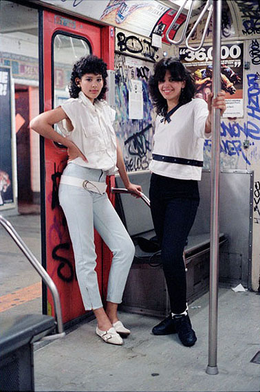
Here is a photograph by Jamel Shabazz in the 80's. This was taken in New York on the train and immediately you see their fashion sense in the image. Personally, I like the location of this image and how there's graffiti on the wall. I think the location is well suited for street photography because the train stations are very urban. I like the colours in this image because it's very pale and I think the lighting is used well because it bounces on their clothes and their faces.

This is another image on the streets of New York. I like how he's used a shallow depth of field on the background considering this was in the 80's. Even with the background blurred, this still works with location photography because you can still see the streets in a different way, which is why I quite like this image. Furthermore, you can see the 80's fashion coming through with the chain and the rings. I like the colour tones in the image because it looks quite vintage and this is quite an effective technique that works with the 80's.
2. Janet Delaney
2. Janet Delaney

This is another 80's photographer who did location photography. This is a reflection from a glass which reveals the city. The style from the 80's really resembles in this image. You can see this man stood there with his mullet hairstyle. Even the cars are very retro. I think it's quite an appealing image from the 80's. I've noticed how back in the days, the images are very warm and they tend to have this washed out look to them which is frequent in these images.

Here is another example of location photography. I've chosen this because I like the colours in the image because it's very muted/pale which makes it stand out in some situations. I liked how the format of the image is a square so the position of the camera was done quite well, with the way the lamppost and the building are quite parallel. You can tell how the image is lowered in contrast with the way the sky looks grey. I think this could work as a technique to make the image look older than it is.
1. Lynn Goldsmith:
Famous music photographer


2. Jim Marshall:
Famous music photographer


Norman Seeff was a photographer who worked with different artists and bands for photoshoots. He also contributed in photographing, art directed and deigned hundreds of record covers over these decades. This includes some of the popular bands and artists from The Rolling Stones to Aerosmith and many more. Mainly been designing albums from 1969 to 1989.
Moodboards:
1. Lynn Goldsmith:
Famous music photographer

Lynn Goldsmith was a famous celebrity photographer who worked with lots of artists around the 70's and 80's. Alongside working with Michael Jackson, she has achieved a lot with different musicians where her image has been used as an album artwork/record covers, magazine covers and book covers. I've selected Michael Jackson because I think 'thriller' is so popular coming from the 80's and Lynn Goldsmith was indeed part of it.
Famous music photographer

Jim Marshall was also another famous music photographer who worked with multiple artists especially in the 60's, 70's and 80's. He worked with The Beatles as shown in the example and worked with lots more. His photography was also used for many album artworks and magazines too. Luckily he was given opportunities to work backstage and eventually built his reputation till he worked for a music label for him to photograph their artists.
3. Norman Seeff:
Famous music photographer
3. Norman Seeff:
Famous music photographer


Norman Seeff was a photographer who worked with different artists and bands for photoshoots. He also contributed in photographing, art directed and deigned hundreds of record covers over these decades. This includes some of the popular bands and artists from The Rolling Stones to Aerosmith and many more. Mainly been designing albums from 1969 to 1989.
Moodboards:
 |
| 1960 |
This is my moodboard for 1960. I've thought of art, musicians, films, cities, war, peace, hippies, fashion and styles that my interpretation of the 60's are. Of course there are lots more and the list is endless but I've compiled these images of what I could.
 |
| 1970 |
This is my 1970's moodboard and I've compiled these images together. I've gathered the disco theme, the bands, art, technology, war, city, fashion and cars to summarise the 70's in a nutshell. To me, the 60's and the 70's are fairly similar except a few changes in society like women's rights being equal as men. Art and music got a little more advanced and photography got more technical and colourful.
 |
| 1980 |
This is my 1980's moodboard and here I've kept it a little more simpler showing the city, technology, bands, artists, fashion and art. This was the decade when MTV was the first broadcasting station and everything was starting to get a little advanced. The fashion changed from hipster to gangster and rap became popular in demand.
Additional Library Research:
Here are some images that has been taken in the 60's and 70's on location that I thought were quite interesting.
These images was taken in the 60's and they were featured for Italian Vogue. I liked the details of the smoke. You can see the fashion and style element with this image because of the way she's dressed especially for a Vogue magazine cover. I like how there's a vintage look to their style and the actual image is black and white which gives it an effect.
Here is another Vogue cover for France. This image is quite cool in the 70's because the photoshoot was of a fire blast and you can see the models in action. This image has colour but it's also quite washed away. I like the location of this old house that is caught on fire and I think it's quite a unique cover for a fashion magazine cover. You can definitely see the styles and fashion in the image coming from the 70.
Here are some images that has been taken in the 60's and 70's on location that I thought were quite interesting.
 |
| 1960 |
These images was taken in the 60's and they were featured for Italian Vogue. I liked the details of the smoke. You can see the fashion and style element with this image because of the way she's dressed especially for a Vogue magazine cover. I like how there's a vintage look to their style and the actual image is black and white which gives it an effect.
 |
| 1976 |
Here is another Vogue cover for France. This image is quite cool in the 70's because the photoshoot was of a fire blast and you can see the models in action. This image has colour but it's also quite washed away. I like the location of this old house that is caught on fire and I think it's quite a unique cover for a fashion magazine cover. You can definitely see the styles and fashion in the image coming from the 70.
 |
| 1979 |
This is another example from the 70's coming from a war background. You can see the location that they went to shoot and I think it's quite effective with the sky/clouds. You could say that it's smoke but I'm not quite sure. This was taken in Tokyo by a female photographer named Miyako Ishiuchi.


No comments:
Post a Comment