Bear in mind, this shoot wasn't really planned and I didn't have a fully booked studio so it was mainly done on the spot. I think it went fairly well and I tried to use different lighting within my time in the studio. I think for an umbrella shoot, it went well because I got to be creative in some ways. Here are my images:
I selected this image here because I liked how I've photographed this umbrella on its own. I think this wooden stool makes it effective because it gives it this old theme. I brought in this huge umbrella for this shoot because I thought it would look great to work with in the studio. In this image, I used high key lighting and I had it bright enough to not create any harsh shadows behind. I think the lighting could have gone better in my opinion if the background was a balanced grey/white colour but this was what I had to work with.
After changing the lighting, this is a better image in my opinion. I like the way Josh is modelling in this because I told him to slouch, it looks more casual than constructed. The lighting would have been perfect if I had the background to be a balanced grey. I like the shadow that is created in this image of the umbrella. I think it just helps bring out the purpose of the image. It also gives the image some depth because there's more tones. I think the contrast is well and the details on the umbrella is exposed well. Looking back, the only thing I would critique is having the logo of the umbrella included as an additional feature.
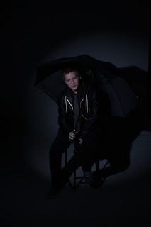
Here we have some low key lighting, which is indeed becoming my favourite the more and more I use studio. I created these dark, moody images of my umbrella. In this shoot, I used a snoot so that the light is directly focused on Josh. I think these images are interesting because you can see the umbrella and there's also a shadow to give it more depth. I think the contrast in these images are great and effective because it emphasises on the dark mood it creates. In the second image here, my purpose was to hold the umbrella in this position because I liked how half of his face was under shade. I thought it just made the image look interesting and it allows me to be a bit creative with my images at the least.
Bonus - This is a bonus image that was captured, and I think it was a bit of fun and creative to create. This image reminds me of Mary Poppins with her flying umbrella for some weird reason. I like how this image turned out like my model is actually trying to catch the umbrella like we're under strong wind. Again, this would have looked better under high key lighting in this case because I think the less shadows and brighter background would make it a lively image.


No comments:
Post a Comment